Canva Hacks for That Vintage Aesthetic
My go-to tricks for a retro rewind.

Image Credit: Shamblen Studios
You know how some people inherit fine china or a timeless diamond necklace? I never knew my grandma, yet she left me a huge box full of old slides and a deep appreciation for all things vintage. Thanks Grandma Gerry!
So when it comes to creating content in Canva, it’s no surprise that I always find myself reaching for those vintage aesthetics. From the washed out tones, grainy overlays, or backgrounds that whisper “1970s magazine ad,” it just has this magic way of grabbing my attention. And, apparently yours too if you’ve stumbled upon this blog post.
Lucky for us, it’s ridiculously easy to recreate that timeless look—even if your design skills peaked in elementary school at the glitter glue phase (white glue, get out of here).
I’m spilling my favorite Canva hacks for creating a vintage aesthetic. These are the tricks I use in my own personal work and they’ll help you make your brand instantly cool and a lil’ bit nostalgic.
Hack #1: Overlay a Grain Texture
Think of grain as the dry shampoo for your graphics: a little spritz and suddenly everything is effortlessly chic. What I love about adding grain is that is smooths over imperfections and adds dimension (think back to those old photos, there’s always a fine grain from the ISO!) giving you that film-photo-from-grandma’s-attic energy.
How to do it in Canva:
Search “grain texture” in Canva’s Elements tab
Pick one of the transparent PNG options (you’ll see a bunch that look like static on an old TV).
Drop it over your photo, adjust the transparency to about 15–30%, and boom—you’ve got that retro film feel.
I use grain overlays all the time. Sometimes I’ll add a heavier grain on photos meant for Instagram, because smaller phone screens love that extra grit. Other times, I’ll keep it lighter for Pinterest, so text doesn’t get too lost in the noise. Either way, it’s the fastest hack to go from polished stock photo to instant vintage aesthetic.
Hack #2: Adjust Perspective on Background Textures
Canva has come a long way since they first started, and one of my favorite features is the Reshape app by PixelTeam. It’s essentially a magic wand for making your backgrounds look like they belong. If you don’t already have it enabled for your Canva account, simply go here to enable it first.
How to do it in Canva:
Search “vintage tiles background” in Canva’s Elements tab. Aim for photos that have lots of tiles to work with.
Drag your favorite one onto your canvas; size and rotate it to fit your image
In the bottom left corner of your sidebar, click the “Reshape” app while your background image is highlighted
Hit “Perspective” and drag the points so it fits the perspective of your image
If it looks too stretched out, then click “Distort” to shrink it down
Click “Save”!
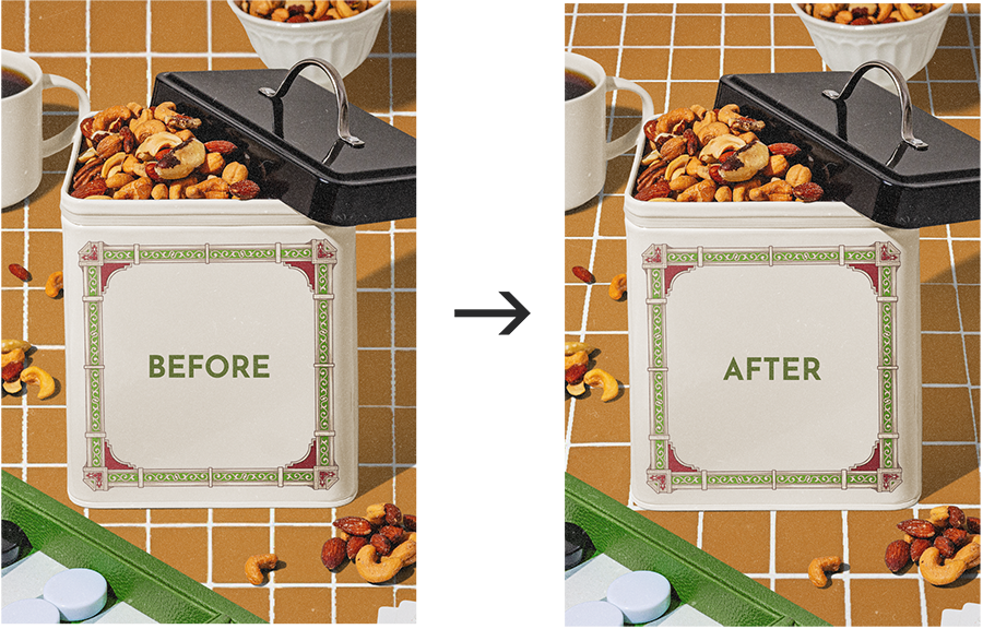
You’ve be surprised how this little detail pulls everything together. Without adjusting for the correct perspective, it looks fake and that’s not what we want!
Hack #3: Wash Out Your Colors
If you’ve been following me for awhile, then you’re well aware of how much I love color! But when you’re chasing that vintage aesthetic Canva cream dream, the secret is muted, washed-out tones. Think of it as your mom’s denim jacket from the 90s that’s been washed too many times: it’s finally comfortable and doesn’t scream “fresh from the rack.”
How to do it in Canva:
With your image highlighted, use the “Adjust” panel and lower Saturation slightly
Nudge the Brightness up just a wee bit
Slide the Contrast and Blacks down until your colors look sun-faded
Finally, adjust the Temperature to the right to add some warmth
I see my members do this often, and it’s awesome to see what they come up with. If you’re part of my photo membership, then you know that you can tweak any of my templates to your hearts desire to have it fit the exact look you’re going for.

Hack #4: Use Vintage Background Images
Backgrounds are where Canva really shines. If you type “vintage” into the photo library, you’ll find everything from faded wallpaper patternes to Polaroid frames. Dropping one behind your design is like setting the stage for your content.
Some of my favorites are:
Old paper texture (great to go behind your text)
Retro floral wallpaper (make anything an old wall)
Vintage brick wall (I live in NYC, I’m such a sucker for those brick walls)
Mountain-top meadow (think Sound of Music or old postcard vibes)
1970 wood paneling (you’re lucky if your basement didn’t have it)
Don’t be afraid to play around with color adjustments for those, too!
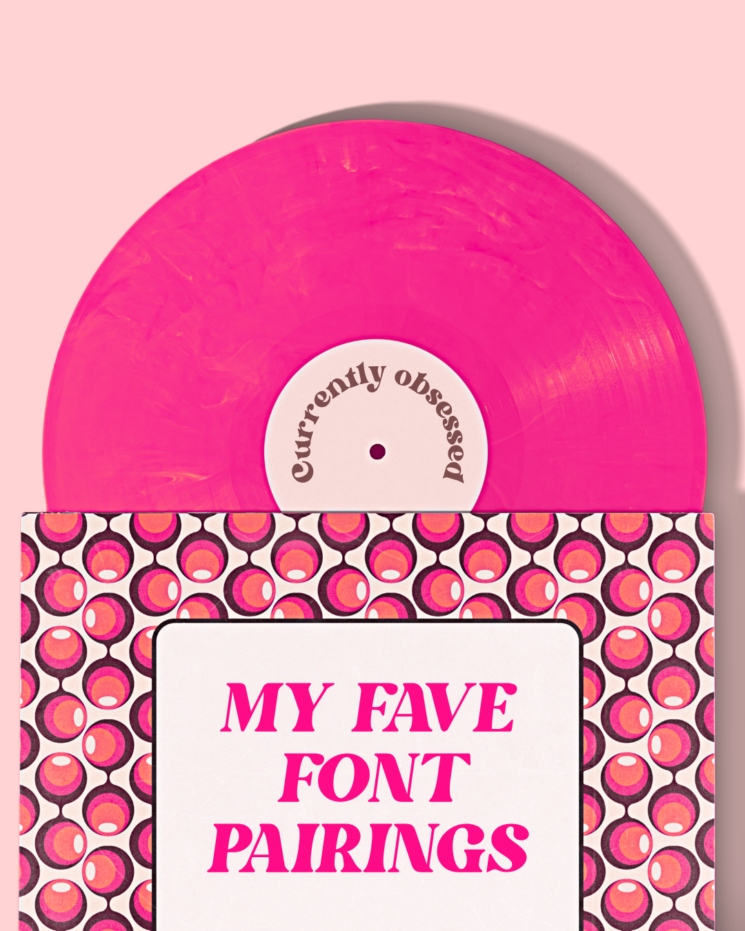
Hack #5: Play with Fonts that Belong on Vinyl Covers
My husband and I just launched a new experience in New York City called Couple’s Only, which is a vinyl listening experience for your and your favorite person—paired with a wine fortune. So, vinyl records have been on my mind lately… and it’s also fantastic inspiration for typography.
A vintage look isn’t just about colors and textures—it’s also about type. The art of typography is about evoking emotion and making sure it aligns with the rest of the branding, or feeling of the image.
Canva has a surprisingly solid selection of retro-inspired fonts that make your designs feel real.
Here’s a few of my faves:
Gistesy for handwritten notes or signatures
Anton for bold, poster-style headlines
Glacial Indifference for that mid-century magazine feel
Honestly, any of the Tan fonts as they have lots of retro personality
Bright Retro for that classic 70’s feel (shown on the vinyl record below)
Play with the spacing of the letters and capitalization, too. Using capital letters tracked out adds a luxurious feeling to your content.
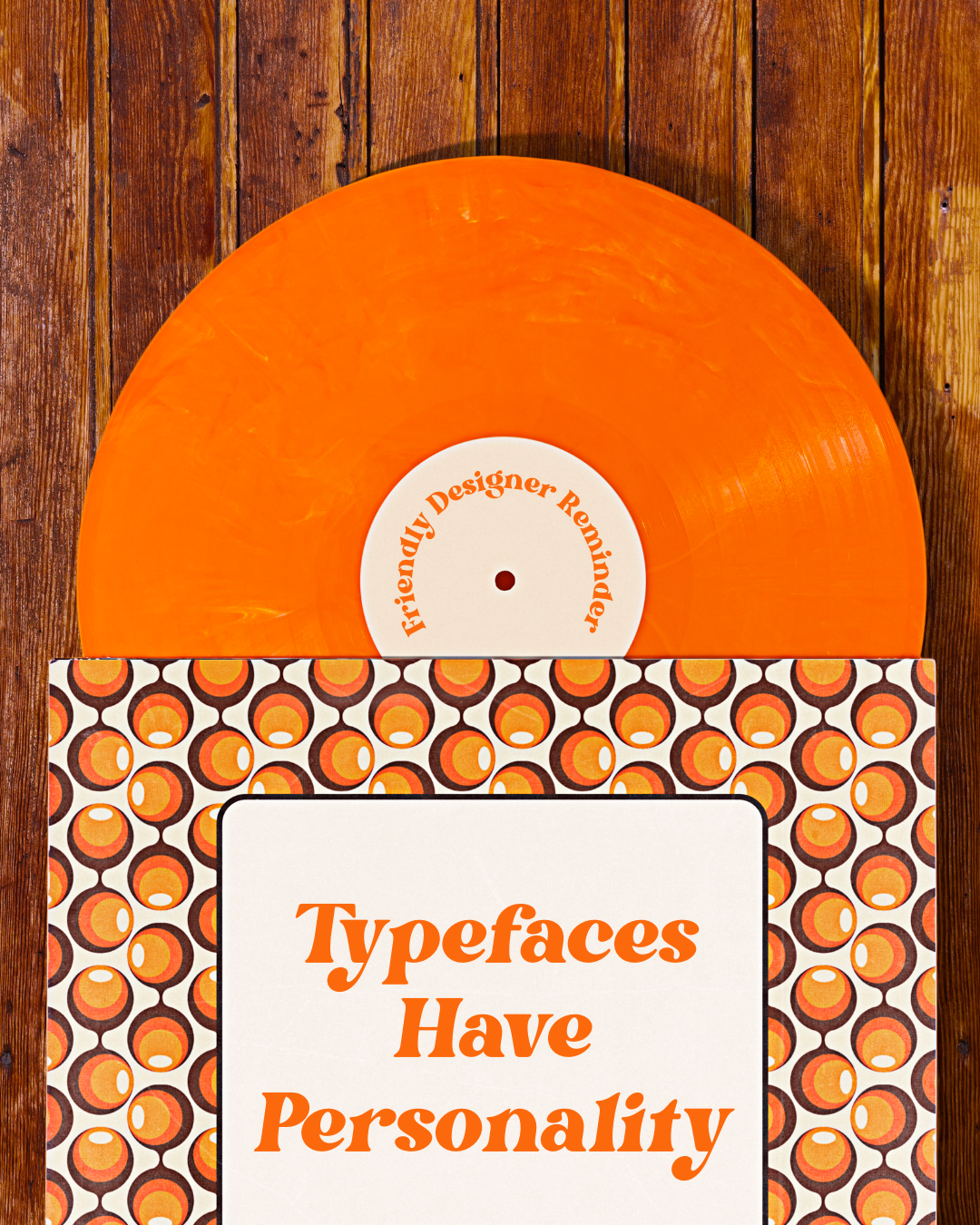
Image Credit: Shamblen Studios
Want to Skip the Blank Canvas?
If you'd rather start with the retro vibe already built in, these templates were basically made for everything we just covered. Open in Canva, swap your text, then layer in the grain, washed-out tones, and vintage fonts from above, and you're done. Each one is $9 and opens directly in Canva. 👉 Browse all retro templates in the shop


Why Does This Matter?
“Vintage aesthetic” may be a trend, but it’s one that is consistent. We live in a world where everything is digital and we crave that familiarity. I still shoot film, but many people don’t because, well, it can be a pain. And we don’t have time for pain ;)
So why bother with all these hacks? Because standing out online is hard. Everyone is churning out content like it’s their side hustle (and for some, it is). A vintage aesthetic is just another way to help you stand out, or portray a feeling you’d like to evoke through the screen.
It’s the kind of feeling that makes people stop scrolling and think, “I want to hang out here a little longer.” And when people hang out with your content, they’re more likely to remember you, trust you, and eventually buy from you (if that’s the goal you’re going for).
Also, it’s just a lovely approach.
Get Started with Free Templates
If you don’t feel like starting out from scratch, I’ve put together some of my favorite drag-and-drop templates that make the perfect base for experimenting with all the tips in this post.
Think of them as your content playground—you’ll be able to overlay grain, adjust perspectives, wash out colors, and add those nostalgic backgrounds and fonts without having to build everything from scratch.
👉🏻 Sign up for my email list here to grab your free templates
Once you’ve got them, you can test out these hacks right away and see which ones resonate the most with you and your brand. Oh, and here’s another tip for you…
Bonus Hack: Export and Then Apply These Effects
When you’re editing templates, applying the same effect to every element is tedious… and who doesn’t love saving time?
How to do it in Canva:
When you finish editing your template, export it as a JPG or PNG
Then, drag that photo back into Canva onto a new page
Apply your effects—this way, when you adjust colors or brightness, everything will be affected.
Your Turn
I can’t wait to see what you’ll create! Please tag me on Instagram @shamblenstudios or comment below so I can see what you’ve made.