The Secret Sauce Behind Scroll-Stopping Graphics (Hint: It’s Not Photoshop)
You don’t need Photoshop, a design degree, or 10 hours a week to create graphics that actually get noticed.
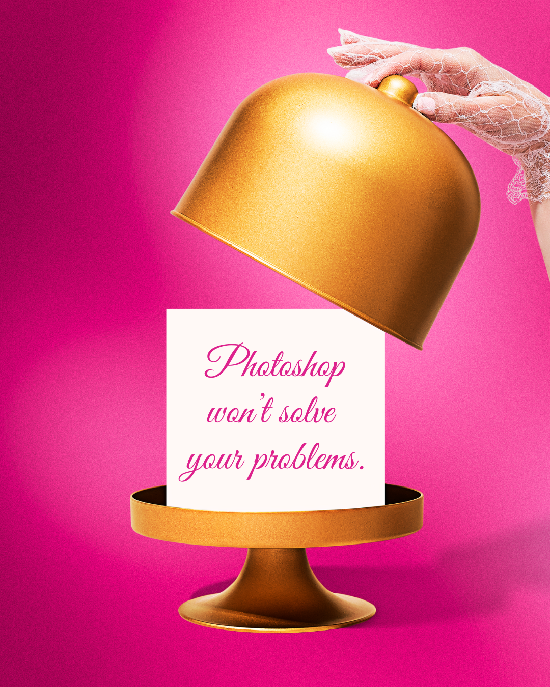
Image credit: Shamblen Studios
In fact, some of the most engaging content on Pinterest and Instagram isn’t made with complicated tools at all. The real secret? It’s all about consistency, color, and a little creative shortcutting—aka customizable templates.
Let’s dive into what really makes content pop—and how you can replicate that look in way less time.
1. Visual Consistency Is Everything
You know when you land on someone’s page and instantly think, “Whoa, they have it together”? It’s not because they spent 19 hours on one pin. It’s because their content looks cohesive.
Same tones. Same color palette. Same vibe.
It’s like walking into a cute boutique where everything just works—instead of a clearance rack explosion at 11pm. In fact, consistent use of visual elements like logos, colors, and fonts can improve brand recognition by up to 80%!
The cool thing? That look is totally doable with templates. You don’t need to reinvent the wheel every time you post. Just find your visual rhythm and roll with it.

Image credit: Shamblen Studios
2. Bold Color = Instant Attention
Color is one of the fastest ways to stand out, especially on Pinterest (aka the visual jungle). Whether you lean into dreamy neutrals or go full sunshine-and-orange-slice mode, bold color combos create instant brand cohesion.
When I started using my own photo-based templates with stronger color contrast, I noticed way more engagement—and fewer “meh” scrolls. So yeah! Color matters. And no, you don’t need to hire a color theorist.
✨ Fun fact: My templates are already styled with bold, balanced combos. No clashing. No chaos. Just plug in your brand and go.
3. The Real MVP? Templates.
Templates are like the Trader Joe’s frozen meals of content creation. Delicious. Easy. Stress-free.
Instead of wrestling with Canva at midnight trying to make something “pop,” you can just open a template, pop in your brand colors, change the text, and be done in minutes.
Seriously—when I made my first set of templates, it was because I was that overwhelmed business owner who wanted great-looking content without the meltdown.
So I built what I wish I had years ago: done-for-you, photo-based Canva templates that are chic, colorful, and ridiculously easy to use.
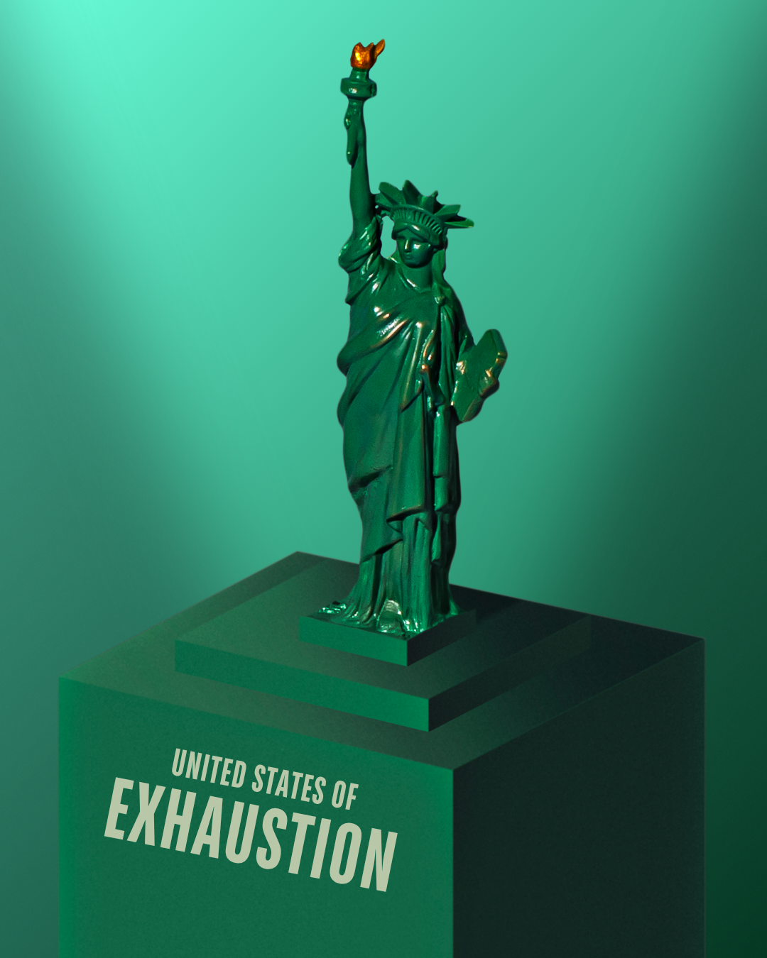
Hot tip: don’t become the next President of the United States of Exhaustion when it comes to your online marketing—let templates do the heavy lifting for you.
🛑 Let’s Talk About What You Don’t Need
Here’s what’s not required for scroll-stopping graphics:
Photoshop
A new photoshoot every other week
That “graphic design” degree you almost applied for
37 open browser tabs and a Pinterest board named “content someday”
You just need the right visual foundation and a little bit of consistency. That’s it.
Ready to Make Content That Doesn’t Drain You?
If creating graphics has ever made you question your entire marketing plan (or just made you really want a nap), I’ve got you.
Grab a set of my ready-to-edit Canva templates. They’re built for small business owners who want their content to look put-together without spending hours glued to a screen.
Let’s take some pressure off your plate—and make your content actually fun again. 💛